
Thoughtful Logo Design

Logos are not art projects.
They are tools.
A logo has a job to do, and that job starts before someone reads your name, understands your offer, or decides whether they trust you. Most people never consciously analyze a logo, but their brain is absolutely clocking it.
That’s why some logos feel instantly familiar, credible, and established, while others feel forgettable or confusing, even if they’re technically “well designed.”
This guide breaks down evidence-based rules for logo design, using recognizable brand systems like Coca-Cola, Disney, and The Home Depot to show how strong logos work at a structural level. Not emotionally. Not stylistically. Structurally.
The goal is not to copy these brands.
The goal is to understand why their logos function so well, and how those same rules can be applied intentionally to any business, at any scale.
Evidence-Based Rules for Building a Logo That Actually Works
Logo design is not about personal taste.
It’s not about what feels pretty.
And it’s not about whether you like a font.
Strong logos succeed because they follow repeatable, observable design rules that have been proven across industries, decades, and cultures.
This guide breaks down those rules using well-known brand systems, then shows how the same principles are applied intentionally in the Contained Madness logo as a case study.
Rule 1: A Strong Logo Is Recognizable Even When the Words Change
One of the clearest indicators of a strong brand identity is recognition independent of language.
If the words in a logo can be replaced and the brand is still recognizable, the logo system is doing real work.
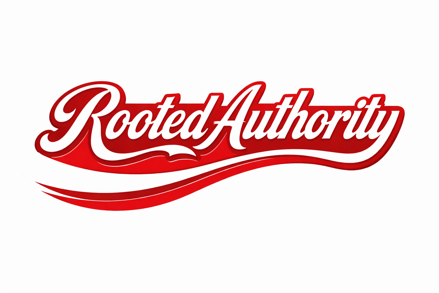
Case Study: Coca-Cola
In this example, the words “Coca-Cola” have been replaced with “Rooted Authority,” but most viewers still immediately recognize the original brand.
That recognition does not come from the name. It comes from:
The custom script style
Letterform rhythm and flow
Stroke contrast
Proportions and spacing
The distinctive underline swoosh
This demonstrates a critical principle:
When typography alone communicates brand identity, the logo system is strong.
If a logo only works because of the literal words it spells, it is fragile.
Rule 2: Brand Recognition Lives in Structure, Not Decoration
Decoration is optional. Structure is not.
Strong logos rely on repeatable structural elements that survive simplification, reproduction, and reinterpretation.

Case Study: Disney
Without referencing any characters, icons, or trademarked imagery, this typography still signals:
Family-friendly content
Storytelling
Imagination and emotional warmth
Entertainment as an experience
Most viewers will instinctively place this logo into the same category as Disney, even though the words say something entirely different.
That tells us something important:
Category recognition happens before brand recognition.
Typography alone can communicate emotional positioning, industry category, and audience expectation.
Rule 3: Industry Signaling Must Be Immediate and Unambiguous
Before someone knows who you are, they should know what kind of business you are.
This happens in milliseconds and is driven by visual weight, geometry, and contrast.
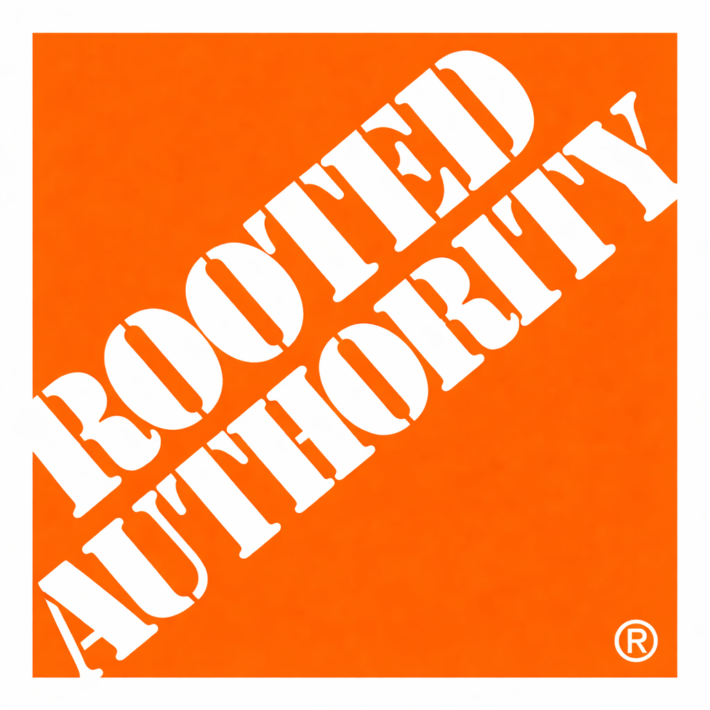
Case Study: The Home Depot
This logo signals:
Industrial utility
Physical labor and materials
Durability and authority
Large-scale infrastructure
That signal comes from:
Heavy slab-serif typography
Aggressive scale
Diagonal composition
High-contrast white-on-orange
A square container acting as signage, not decoration
None of this depends on the name itself.
If your logo could be swapped into a completely different industry and still feel appropriate, your brand identity is underdeveloped.
Specificity is not limiting. It is clarifying.
Rule 4: A Logo Must Be Modular
Strong logos are systems, not single images.
A functional logo must work as:
A full wordmark
An icon on its own
A reversed version
A monochrome version
A small-scale mark (social icons, favicons)
If removing one element breaks recognition, the logo lacks structural integrity.
This is why the strongest brands can appear on billboards, packaging, apps, uniforms, and signage without redesigning the logo each time.
Rule 5: Color Enhances Recognition, But Structure Creates It
Color supports a logo. It does not carry it.
A professionally designed logo must remain legible and recognizable:
In black and white
In grayscale
In low resolution
In high contrast environments
If a logo relies on color gradients, effects, or textures to make sense, it is not structurally sound.
Applying These Rules: The Contained Madness Logo System
These same rules were applied intentionally in the design of the Contained Madness logo.

Case Study: Contained Madness
1. Icon Independence

The dresser and hanger icon communicates:
Home and organization
Containment and structure
It stands alone without text and remains recognizable at small sizes.
2. Typographic Contrast
The contrast between “Contained” and “Madness” is a functional design choice:
Creates clear visual hierarchy for faster recognition
Improves legibility at small sizes and in digital formats
Preserves recognition when the logo is resized, stacked, or cropped
This contrast supports consistent use across marketing materials before any copy is read.
3. System Flexibility
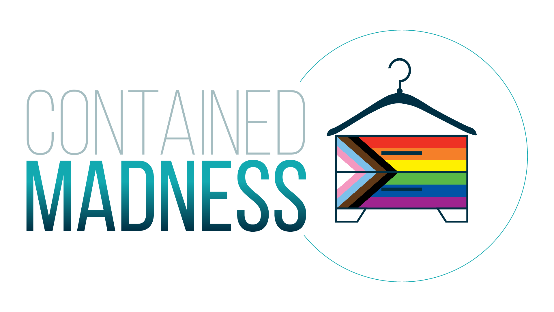
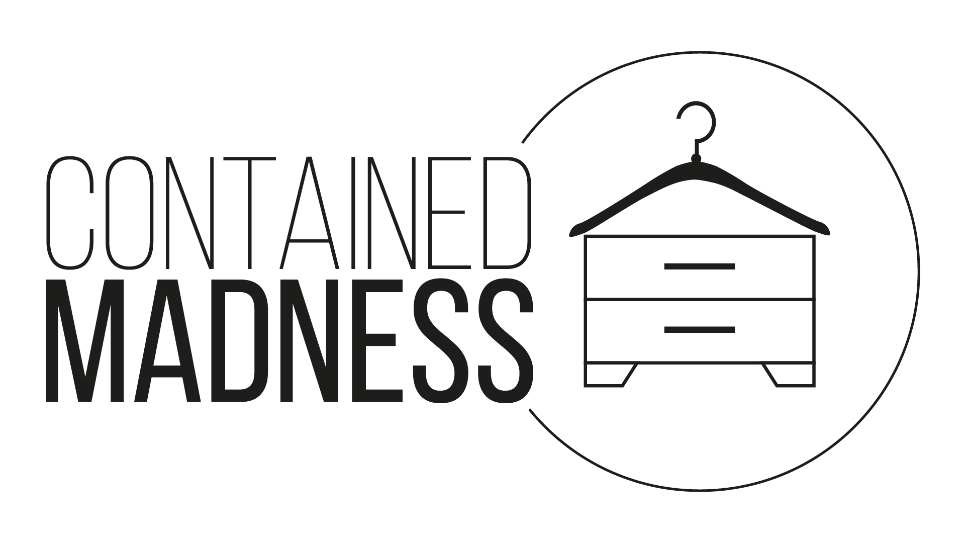


The logo system adapts to:
Different backgrounds
Different contexts
Values-based statement
without losing its core identity.
That is structural strength.
A Practical Checklist for Logo Design
Use this list as a diagnostic tool when designing or evaluating a logo.
Can the logo be recognized if the words change?
Can it function without color?
Can it scale down without losing clarity?
Does it immediately signal industry and tone?
Can the icon stand alone?
Does the typography communicate personality without explanation?
Can the logo adapt without being redesigned?
If the answer is “no” to several of these, I would strongly suggest you continue to refine until your logo is stronger.
Why This Matters
Your logo is often the first interaction someone has with your brand.
Before your website copy.
Before your services.
Before trust is built consciously.
A thoughtful logo reduces friction, builds credibility, and communicates competence silently.
That is not aesthetics.
That is function.
And function is what makes branding last.
Conclusion
Strong logos are not memorable because they are clever.
They are memorable because they are specific, consistent, and structurally sound.
When a logo can survive word changes, color changes, scale changes, and context changes, it stops being decoration and starts being infrastructure. That’s when branding works for you instead of requiring constant explanation.
This is why thoughtful logo design matters. Not because it’s trendy. Not because it’s pretty. But because it reduces friction, builds trust silently, and sets expectations before a single sentence is read.
If you want a brand that lasts, don’t start by asking what you like.
Start by asking what your logo needs to do.